Data Analysis > Descriptive Statistics > Frequency Table and related Graphs-2
Frequency Table for Categorical Data
Suppuse your data file is in MS Excel to read an Excel file as follows:
> library(readxl)
> setwd("/Users/mdfazlulkarimpatwary/documents/Rtraining/")
> data <- read_excel("Cheat.xlsx")
> data

- Frequency Table for Categorical Data
Now to see frequency of the attribute marital the following commands:
freq_m=table(data$marital)
print(freq_m)
Divorced Married Single
3 7 5
barplot(freq_m)

prob_m <- freq_m / sum(freq_m)
print(prob_m)
Divorced Married Single
0.2000000 0.4666667 0.3333333
cumf_m <- cumsum(freq_m)
print("cumulative Frequency Table")
print(cumf_m)
Divorced Married Single
3 10 15
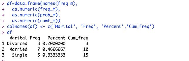
Now combining all the results in a data frame:
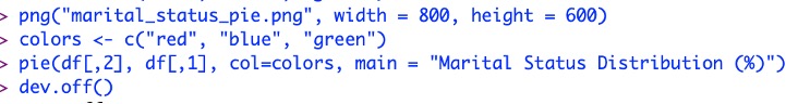
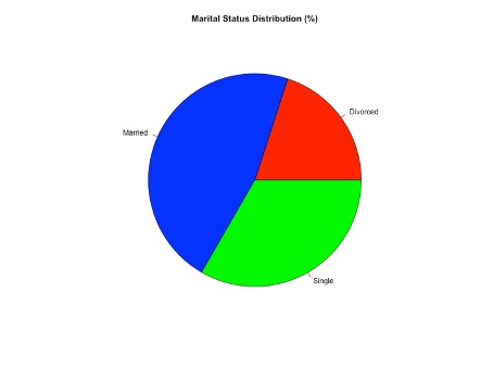
To create a pie chart from the frequency table:
- To assign color for each categories:
colors <- c("red", "blue", "green")
- To save chart on the hard drive in the default folder:
png("marital_status_pie.png", width = 800, height = 600)
- To get category column: df[,1]
- To get percentage colum: df[,3]
- To create the chart: pie(df[,3], df[,1], col=colors,main = "Marital Status Distribution (%)")
Feedback
ABOUT
Statlearner
Statlearner STUDY
Statlearner