Data Analysis > Descriptive Statistics > Frequency Table and related Graphs-1
Frequency Table and related Graphs
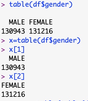
table(df$gender)
x=prop.table(table(df$Gender))

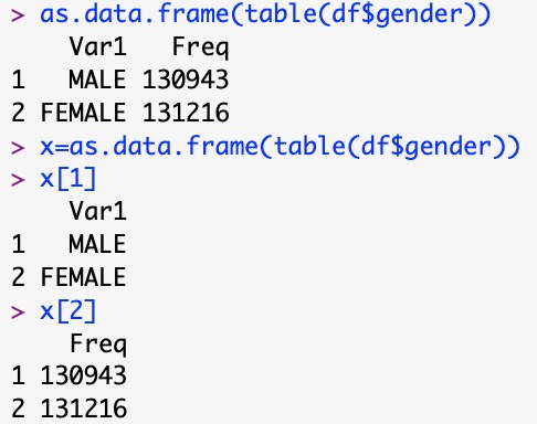
as.data.frame(table(df$Gender))
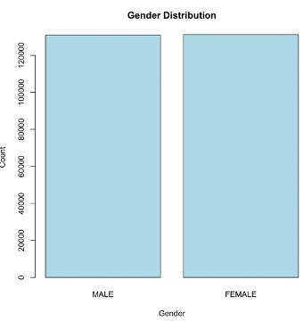
Constructing Bar Plot
gender_freq <- table(df$gender)
barplot(gender_freq, main = "Gender Distribution",
xlab = "Gender", ylab = "Count", col = "lightblue")
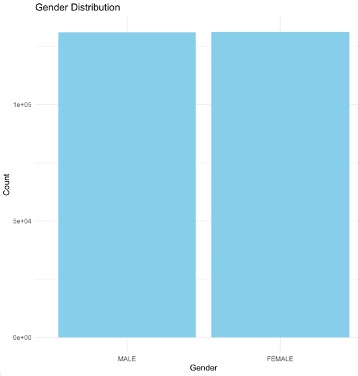
We can use ggplot2 also to have a finest graph
library(ggplot2)
ggplot(df, aes(x = gender)) +
geom_bar(fill = "skyblue") +
labs(title = "Gender Distribution", x = "Gender", y = "Count") +
theme_minimal()
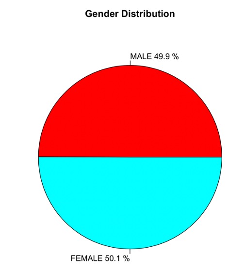
Constructing a Pie Chart
Here we are going to use frequency table saved in a variable ‘x’ which is not a dataframe.
pie(gender_freq,
main = "Gender Distribution",
col = rainbow(length(gender_freq)),
labels = paste(names(gender_freq), round(100 * prop.table(gender_freq), 1), "%"))
Using GGplot2
ggplot(df, aes(x = "", fill = gender)) +
geom_bar(width = 1) +
coord_polar("y") +
labs(title = "Gender Distribution") +
theme_void()

No More
Frequency Table and related Graphs-2
Feedback
ABOUT
Statlearner
Statlearner STUDY
Statlearner