Business Analytics > Data Visualization & Descriptive Analytics > Different Data Visualisation Tools
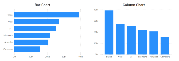
Column Chart and Bar Chart:
Column and bar charts are useful for comparing category-based or ordered data, showing differences between groups of values, and displaying proportions or percentages of a whole.
Column Chart: A column chart shows data using vertical bars. Each bar stands for a category. The height of the bar shows the value. It is used to compare values between categories or to see changes over time.
Bar Chart: A bar chart shows data using horizontal bars. Each bar stands for a category. The length of the bar shows the value. It is used to compare values between categories, especially when there are many categories or long names.
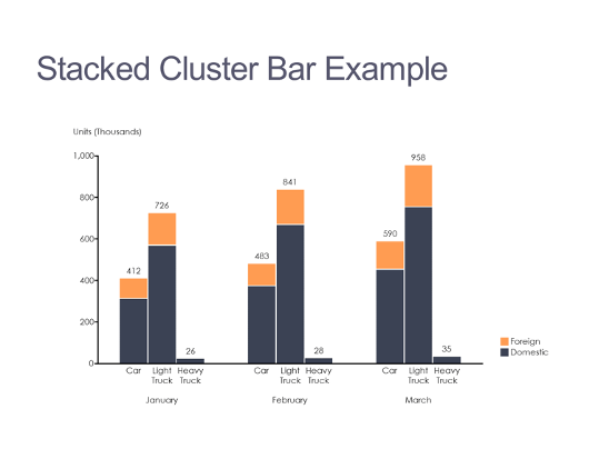
Clustered Column Chart: A clustered column chart compares values across categories using vertical bars placed side by side.

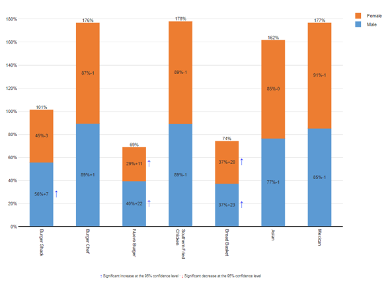
Stacked Column Chart: A stacked column chart shows how each value adds to a total by stacking the bars on top of each other. A 100% stacked column chart compares the percentage contribution of each value to the total.
 |
 |
Line Charts: Line charts are used to show data over time. They display data points connected by lines. Each point shows a value at a specific time. Line charts help identify trends, increases, and decreases. They are commonly used to track changes over days, months, or years.

Pie Charts: Pie charts are used to show how each part compares to the whole. They display data as a circle divided into slices. Each slice represents a category. The size of each slice shows its proportion of the total. Pie charts are useful for understanding percentages and relative shares.

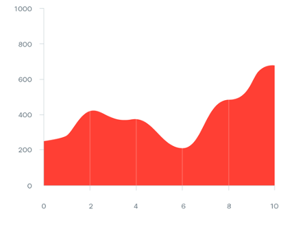
Area Charts: An area chart is similar to a line chart, but the area below the line is filled with color. It shows how values change over time and also shows the contribution of each part to the total. Area charts can display more information than pie charts or line charts alone (Stacked Area Chart). However, if too many data series are used, the chart can become confusing, so area charts should be used carefully.
 |
 |
Scatter Charts: Scatter charts show the relationship between two variables. Each point represents a pair of values. For example, one value can be a midterm exam score and the other a final exam score. The chart helps us see whether high values in one variable are linked to high values in the other or not , or if there is little or no relationship.

Orbit Charts: An orbit chart is a type of scatter chart where the points are connected in order, usually over time. It shows the path that the data follow. Orbit charts can reveal unusual patterns and trends that may not be easy to see in other charts.

Bubble Charts: A bubble chart is like a scatter chart but shows three variables instead of two. Each point is drawn as a bubble. The position of the bubble shows two variable values, and the size of the bubble shows the value of a third variable. This helps visualize more information in a single chart.

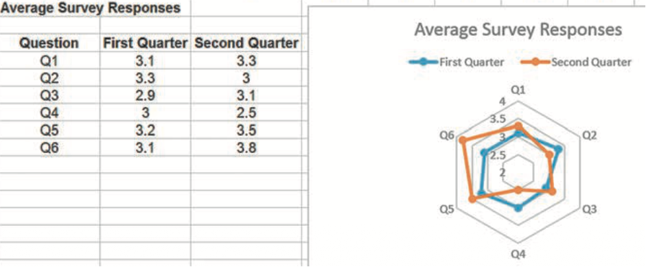
Radar Charts: Radar charts display several values on a spider-web-like shape. Each axis represents a different metric. They are useful for comparing data over time or for comparing the performance of different entities, like companies or factories, using the same criteria. Radar charts make it easy to see strengths and weaknesses at a glance.
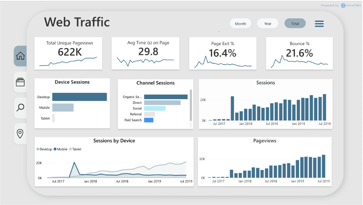
Dashboards:
A dashboard is a visual display of important business information. It is like a car’s control panel, which shows speed, fuel, and temperature. Dashboards summarize key data, are called Key Performance Indicators (KPIs) to help manage a business or a process.
Dashboards are especially useful for senior managers who do not have time to go through large amounts of data. Dashboards show a clear summary of business performance, for example, in monthly or quarterly reviews. They can include tables and charts so managers can quickly find important information.
Feedback
ABOUT
Statlearner
Statlearner STUDY
Statlearner