Data Analysis Using Python > Data Visualization > Histogram
Histogram
A histogram is a type of graph that shows how data are distributed across different ranges. it helps us to know how many values fall into each range. It’s used for continuous numerical data (like age, height, income, temperature, etc.)
Example
import pandas as pd
import seaborn as sns
import matplotlib.pyplot as plt
data = {
'Name': ['Asad', 'Belal', 'Choyon', 'Dulal', 'Aleya', 'Maria', 'Urmi', 'Moury', 'Mili', 'Jhilam'],
'Age': [22, 35, 18, 42, 29, 50, 31, 40, 27, 33],
'Survived': [1, 0, 1, 0, 1, 0, 1, 0, 1, 0]
}
df = pd.DataFrame(data)
# Distribution plot
sns.displot(df['Age'].dropna(), kde=False, color='darkblue', bins=5)
# Labels and title
plt.title('Age Distribution')
plt.xlabel('Age')
plt.ylabel('Count')
plt.show()
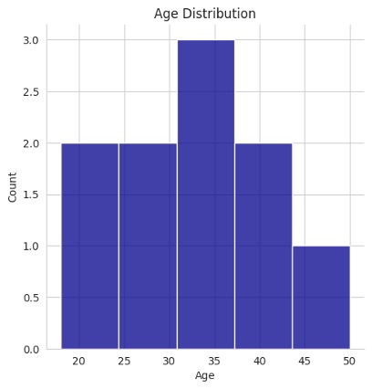
Above histogram is showing how many people fall into each age range (like 15–25, 25–35, etc.)
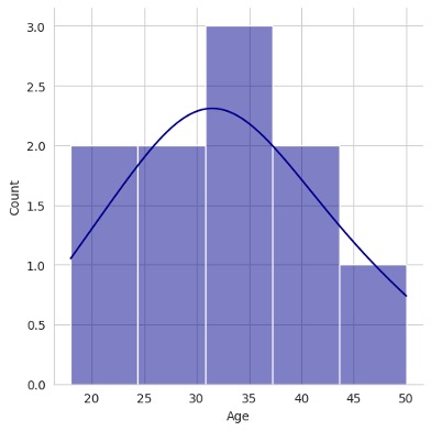
sns.displot(df['Age'].dropna(), kde=True, color='darkblue', bins=5)
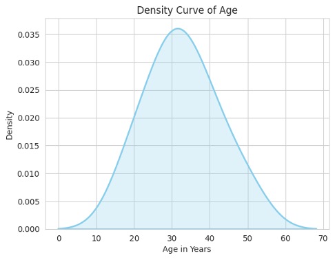
Kernel Density Estimate plot
A KDE plot is a smoothed version of a histogram that shows the probability distribution of a continuous variable. Instead of showing discrete bars like a histogram, it draws a smooth continuous curve that represents where data values are concentrated.
Differences between KDE plot and a histogram is that a histogram shows how many values fall in each bin (using bars) but a KDE plot shows how the data are distributed smoothly across the range.
sns.kdeplot(df["Age"], fill=True, color="skyblue", linewidth=2)
plt.title("Density Curve of Age")
plt.xlabel("Age in Years")
plt.ylabel("Density")
plt.show()
Feedback
ABOUT
Statlearner
Statlearner STUDY
Statlearner